Explaining a scientific finding in a clear and effective way is often difficult. In fact, many researchers struggle with identifying how to best break down their findings’ implications into easily digestible nuggets for a general audience—or even their peers—to understand. For a long time, scientists took a text-heavy, jargon-filled approach to science communication, but the resulting articles often ended up being difficult to read, even for those familiar with the field. To increase scientific communication’s reach, researchers increasingly incorporate more accessible and effective methods, such as diagrams and images, to communicate their research findings to their peers and the public.
We Remember What We See
Humans are visual creatures who more easily absorb and retain information when it is presented as an image compared to text.1,2 This concept, known as the picture superiority effect, explains the root of the saying “a picture is worth a thousand words” and applies to myriad communication styles, including science literacy. When researchers develop graphical messages that complement their article’s text, they present their main message in two ways, making it easier for anyone to understand, regardless of whether they are experts in the field or not.3 This increases the odds of other researchers following up on or citing the original work. In a recent study, scientists analyzed the figures in more than 650,000 publicly accessible research articles and their figures to establish best scientific communication practices.4,5 The group found a clear link between a paper’s graphical information and its scientific reach: papers that contained more schematics and illustrations tended to have more citations and higher impact, suggesting visual information may improve a paper’s clarity.4,5
To jump on the visual bandwagon and increase research articles’ audiences, many scientific journals now encourage scientists to develop graphical abstracts that visually explain a paper’s take-home message.6 This kind of visual summary makes it easier and more intuitive for readers to decide if they want to read the entire paper when they are (virtually) leafing through a journal’s pages or when they are browsing their social media feeds.
Infographics serve a similar purpose as graphical abstracts but typically target a broader audience on social media platforms. Several research studies compared the effect of openly shared infographics versus an article’s abstract on a paper’s visibility and reach.7-9 Across the board, these studies found that people were more likely to redistribute, like, and read the paper related to an infographic compared to a block of text, confirming that graphical representations have a large role in research dissemination and readership.7-9

Filling the Visual Design Gap
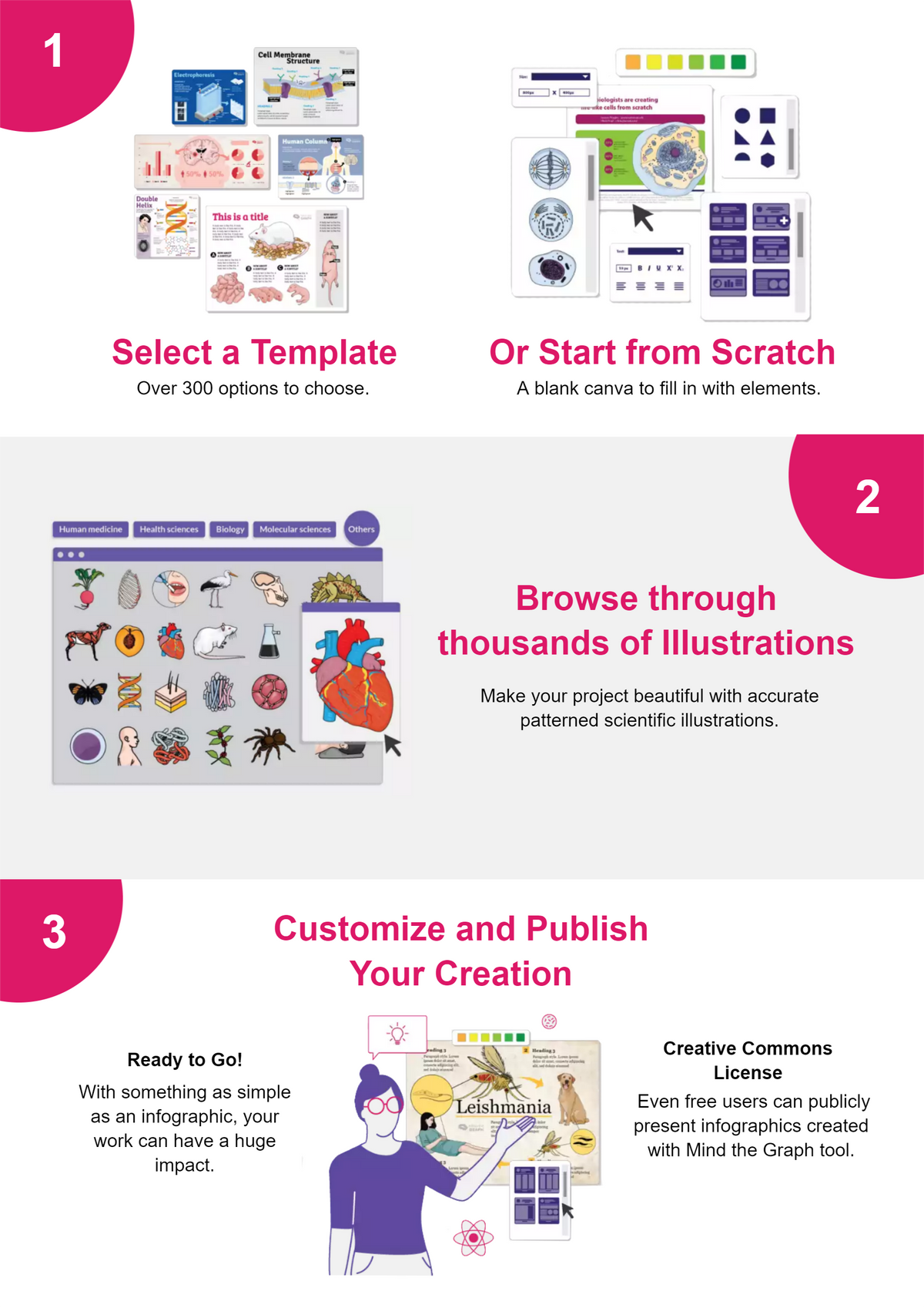
It is clear that scientists should incorporate as many graphical elements in their science communication strategy as possible, but creating visually appealing, informative images may feel like an insurmountable barrier for many researchers who lack graphic design skills. Mind the Graph teamed up with researchers and graphic designers to remove this barrier to accessible, effective science communication. Together, the team developed an easy plug-and-play platform that contains thousands of pre-designed templates for scientists to create their own infographics, graphical abstracts, slide presentations, and posters in record time.10,11 Mind the Graph’s image gallery contains more than 65,000 scientifically accurate images that researchers can arrange and edit in a workspace the size of the intended graphic. In addition, scientists can request on-demand graphics from the organization’s custom design service in case their favorite organism or molecule is not available. The platform offers a free plan to create one customizable graphic, and affordable options are available for trainees, scientists, and research groups depending on their needs. With this platform, it takes very little effort for researchers to wear a graphic designer’s hat and translate ground-breaking findings into beautiful, easily understandable graphics for every audience.
References
- A. Pavio, K. Csapo, “Picture superiority in free recall: imagery or dual coding?” Cognit Psychol, 5(2):176–206, 1973.
- R.E. Mayer, J.K. Gallini, “When is an illustration worth ten thousand words?” J Educ Psychol, 82(4): 715–726, 1973.
- M. Smicklas, “The power of infographics,” Pearson Education, 2012.
- P. Lee et al., “Viziometrics: analyzing visual information in the scientific literature,” IEEE Xplore, 4(1): 117-29, 2018.
- “Graphic details: a scientific study of the importance of diagrams to science,” The Economist, 2016, https://www.economist.com/science-and-technology/2016/06/16/graphic-details, accessed on August 29, 2022.
- C.C. West et al., "Promoting your research using infographics and visual abstracts,” JPRAS, 73(12):2103-05, 2020.
- K.N. Kunze et al., "Infographics are more effective at increasing social media attention in comparison with original research articles: an altmetrics-based analysis,” Arthroscopy, 37(8):2591-7, 2021.
- S. Huang et al., “The effect of an infographic promotion on research dissemination and readership: a randomized controlled trial,” CJEM, 20(6):826-33, 2018.
- A.M. Ibrahim et al., “Visual abstracts to disseminate research on social media: a prospective, case-control crossover study,” Ann Surg, 266(6):e46-e48, 2017.
- J. Mrudula, G. Latika, “Preparing infographics for post-publication promotion of research on social media,” JKMS, 36(5):e41, 2021.
- A. Nascimento, “Mind the graph: the ultimate tool for visual communication in science,” Researcher life, 2022, https://researcher.life/blog/article/ultimate-tool-for-visual-communication/, accessed August 29, 2022.


